Code
Driven
Creativity
designtocode.in
Brief
The website was developed for a leading company specializing in health and safety practices for large-scale events and exhibitions across both government and private sectors. The primary objective of this project was to create an informative and educational digital platform that clearly communicates the organization’s diverse range of services — from on-site safety audits and risk assessments to emergency response planning and compliance consulting. The client required a website that not only represents their credibility and expertise but also simplifies complex safety information for a wide audience — including event organizers, venue managers, and regulatory bodies.
Challenge
Developing a website for a specialized domain like health and safety in large-scale events and exhibitions came with a unique set of challenges. The project demanded a balance between technical accuracy, user engagement, and content clarity — all while ensuring the site aligned with the brand’s credibility and compliance-driven ethos.
1. Complex Service Communication
One of the primary challenges was simplifying highly technical and regulatory content related to safety protocols,
risk management, and compliance requirements. The team needed to present these details in a way that was both
educational and easy for non-technical audiences, such as event organizers and private sector clients, to
understand.
2. Audience Diversity
The website had to cater to a broad spectrum of users — from government officials and private event planners and
vendors. Creating a unified communication style that resonated with all segments without losing depth or authority
required careful content structuring and tone balancing.
3. Visual Representation of Safety Practices
Translating abstract safety concepts like hazard assessment, crowd control, and emergency preparedness into
engaging visuals and layouts posed a design challenge. The goal was to make the content visually appealing
without compromising on the seriousness and professionalism of the subject matter.
4. Content Validation and Compliance
Every piece of information had to be validated against official standards and industry best practices. Collaborating
closely with the client’s compliance team was essential to ensure accuracy and maintain the credibility of safety
guidelines featured on the site.
5. Creating a Scalable and Informative Framework
Since the client’s service offerings evolve with changing safety regulations and event trends, the website needed to
be built on a flexible framework — allowing for easy updates, addition of case studies, and integration of new
safety protocols over time.
6. Balancing Education and Promotion
The project’s purpose was not just to market the company but to educate the industry on safety best practices.
Striking the right balance between informative and promotional messaging required continuous refinement of
the content’s tone and design approach.
Discover
The discovery phase played a crucial role in defining the direction of the website. Before moving into design or
development, our team focused on understanding the depth of the client’s operations, the criticality of their services,
and the unique communication needs of their audience.
We began with in-depth discussions with the client’s safety and compliance teams to gain clarity on their processes,
service offerings, and the regulatory frameworks they work within. This helped us understand the real-world impact
of their work — ensuring that the website didn’t just list services but also communicated the value and necessity of
professional health and safety management for large-scale events.
Through Research and Workshops, We Identified Several Key Insights:
- Users were seeking clarity, not complexity. While the subject was technical, most visitors wanted straightforward explanations and visual guides that helped them understand compliance requirements and available support services.
- Trust and credibility were paramount. For government and enterprise clients, the website had to reflect authority, reliability, and adherence to standards — both visually and through content tone.
- Information hierarchy mattered. With multiple service categories and compliance guidelines, organizing content intuitively was essential to avoid overwhelming users.
- Visual storytelling could bridge the gap. By integrating real-world event imagery, we could make complex safety processes both understandable and relatable.
These discoveries formed the foundation for our content strategy, user flow design, and overall brand presentation. Every design and messaging choice stemmed from this phase — ensuring that the final website became more than just a digital brochure; it became an educational and trust-building platform for the client’s partners, customers, and stakeholders.
Define
Following the discovery phase, our next step was to translate insights into a clear strategic framework for the website.
The objective was to define how the platform would inform, educate, and build trust — while maintaining a balance
between technical accuracy and user engagement.
From our findings, we defined three core pillars that would guide the entire project:
1. Clarity of Information
The website needed to simplify complex safety protocols and regulatory standards into content that was concise,
approachable, and structured. Each service description, process overview, and compliance guide was planned to
educate without overwhelming the user.
2. Credibility and Trust
As the company operates in a compliance-driven sector, the tone and design had to reflect authority, reliability,
and professionalism. We established visual and content guidelines that emphasized the brand’s expertise — including
verified credentials, certifications, and case-based examples.
3. Ease of Navigation and Accessibility
To serve a diverse audience — from government departments to private event organizers — we defined a user-
centric structure. This included clear pathways to key services, downloadable resources, and direct contact options
for consultation or inquiry.
During this stage, we also mapped out:
- User journeys to understand how different stakeholders would navigate the site.
- Content hierarchy to ensure that the most critical information — such as core services and safety processes — was always easily accessible.
- Design direction emphasizing simplicity, trust, and visual representation of safety principles.
By the end of the define phase, we had a clear blueprint outlining how the website would function as an educational and strategic communication tool — bridging the gap between technical expertise and audience understanding.
Understanding
Interviewing key stakeholders to gather insights about business goals.
Research
This phase typically includes both user research and market research.
Insights
Drawing insights from all the data collected during the research phase.
Wireframing
Visualizing the basic structure of future pages and how they fit together.
UI Design
Creating a system of components, patterns, and styles for UI design.
Testing
Verifying that every function of an app is working exactly as required.
Wireframes
We began with a mobile-first approach and then expanded the wireframes to cover web screens. Once the wireframes were ready, we shared them with ProLoanZ for feedback to make sure they matched their goals before moving to the visual design stage.
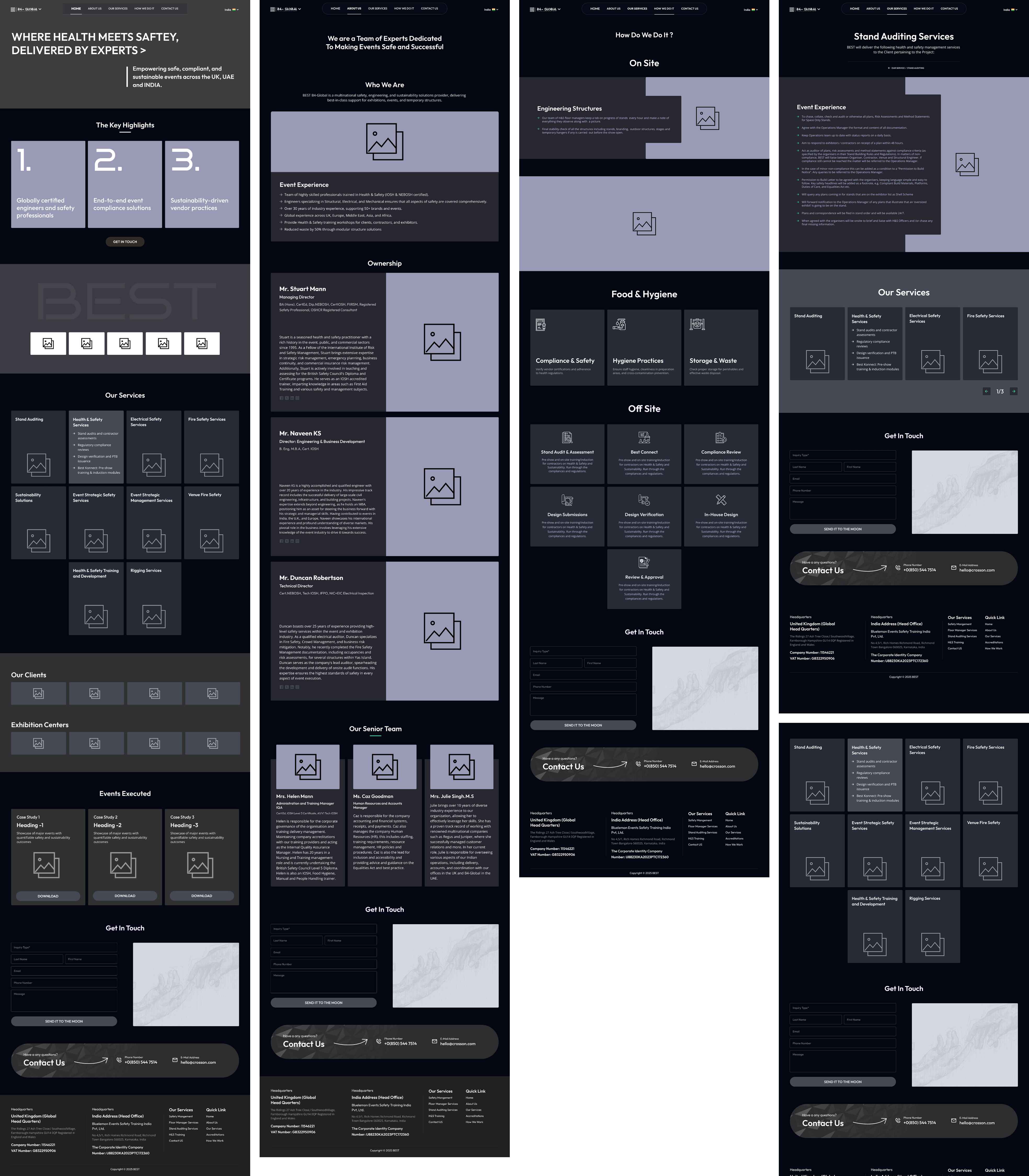
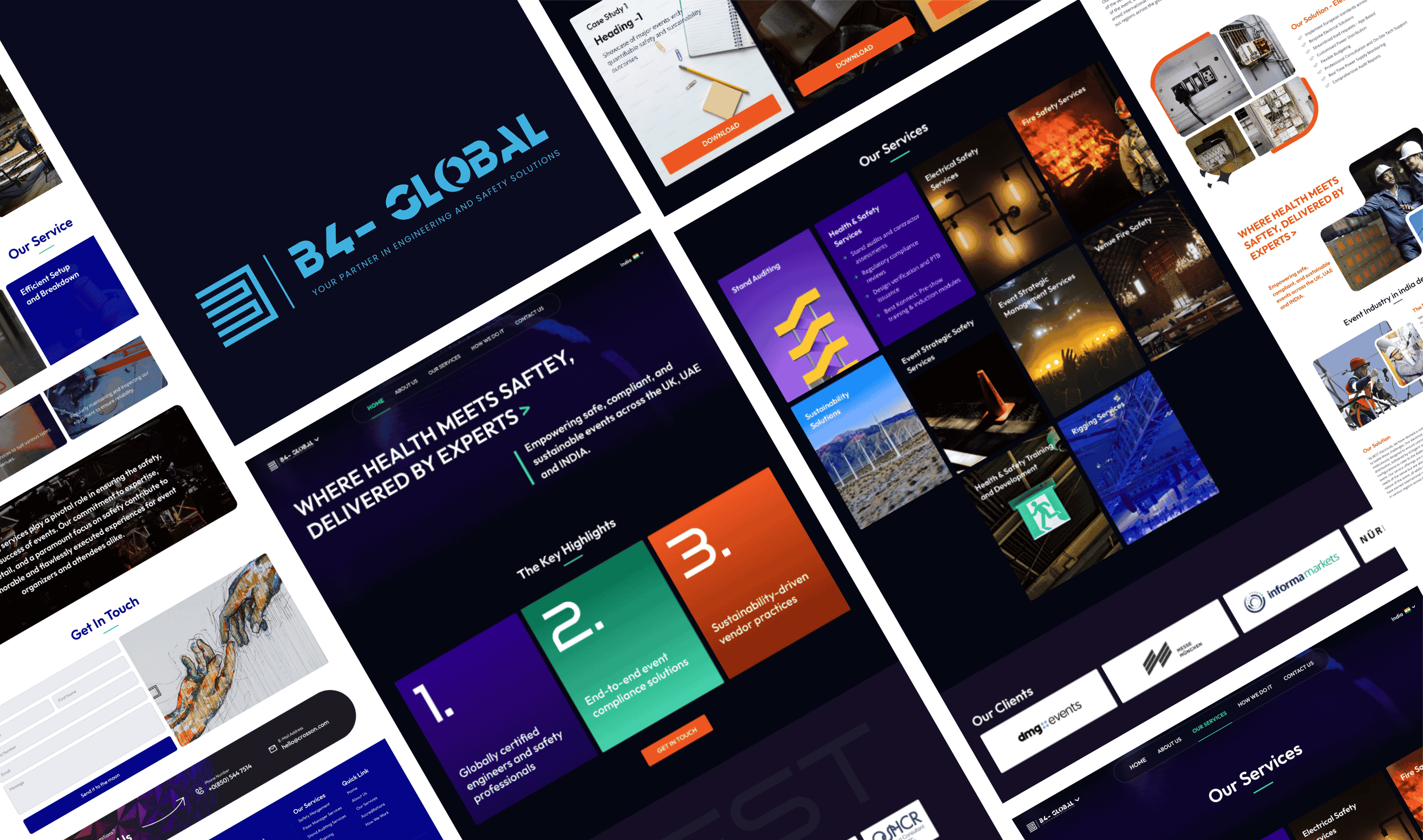
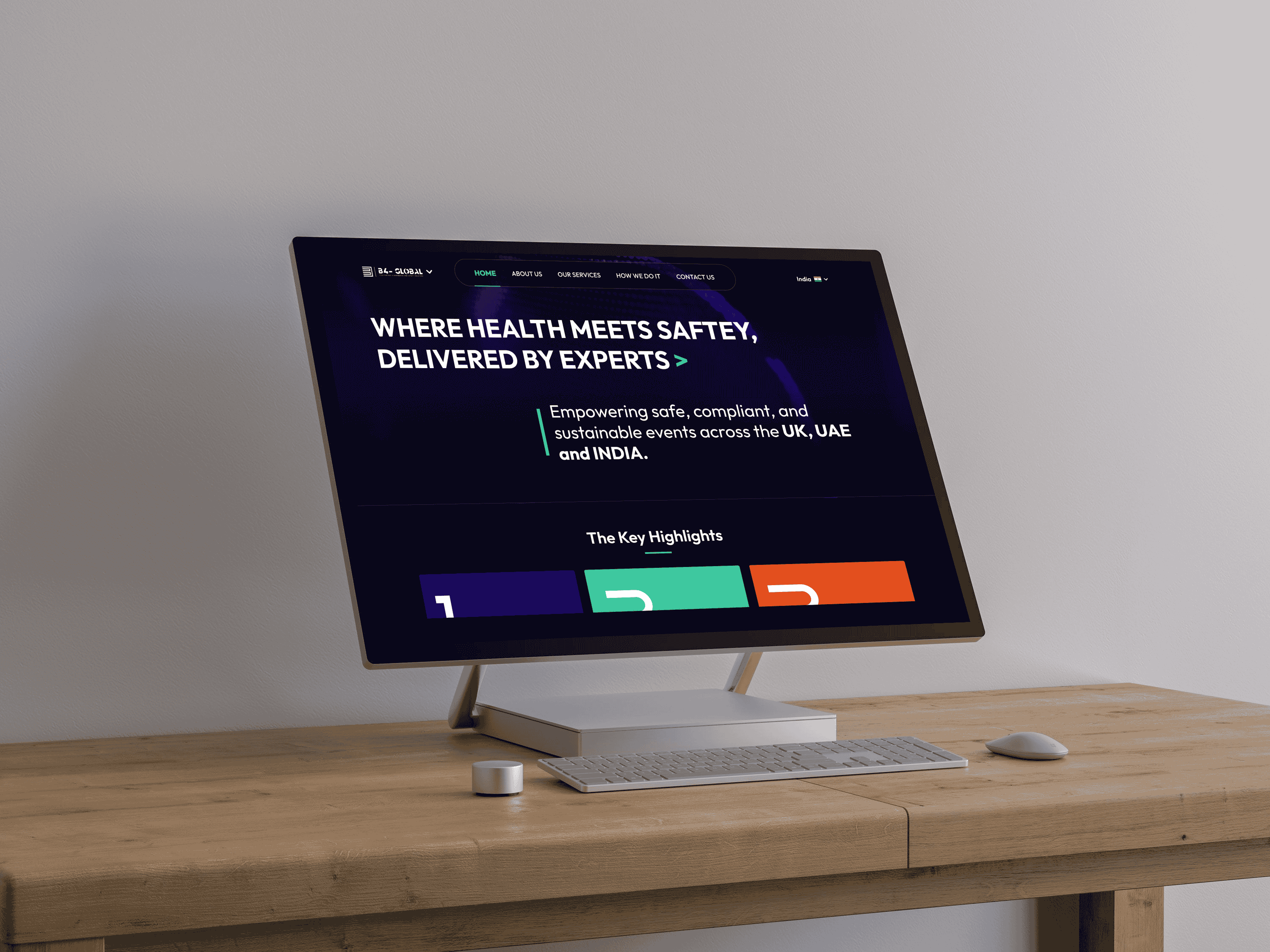
Design & Development
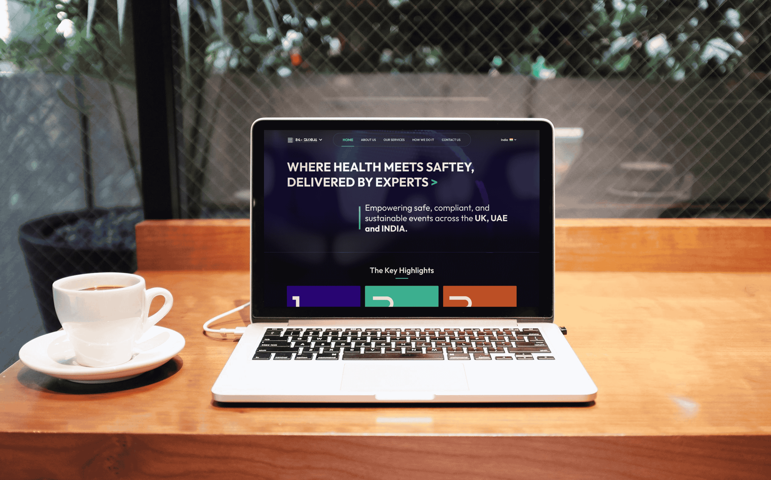
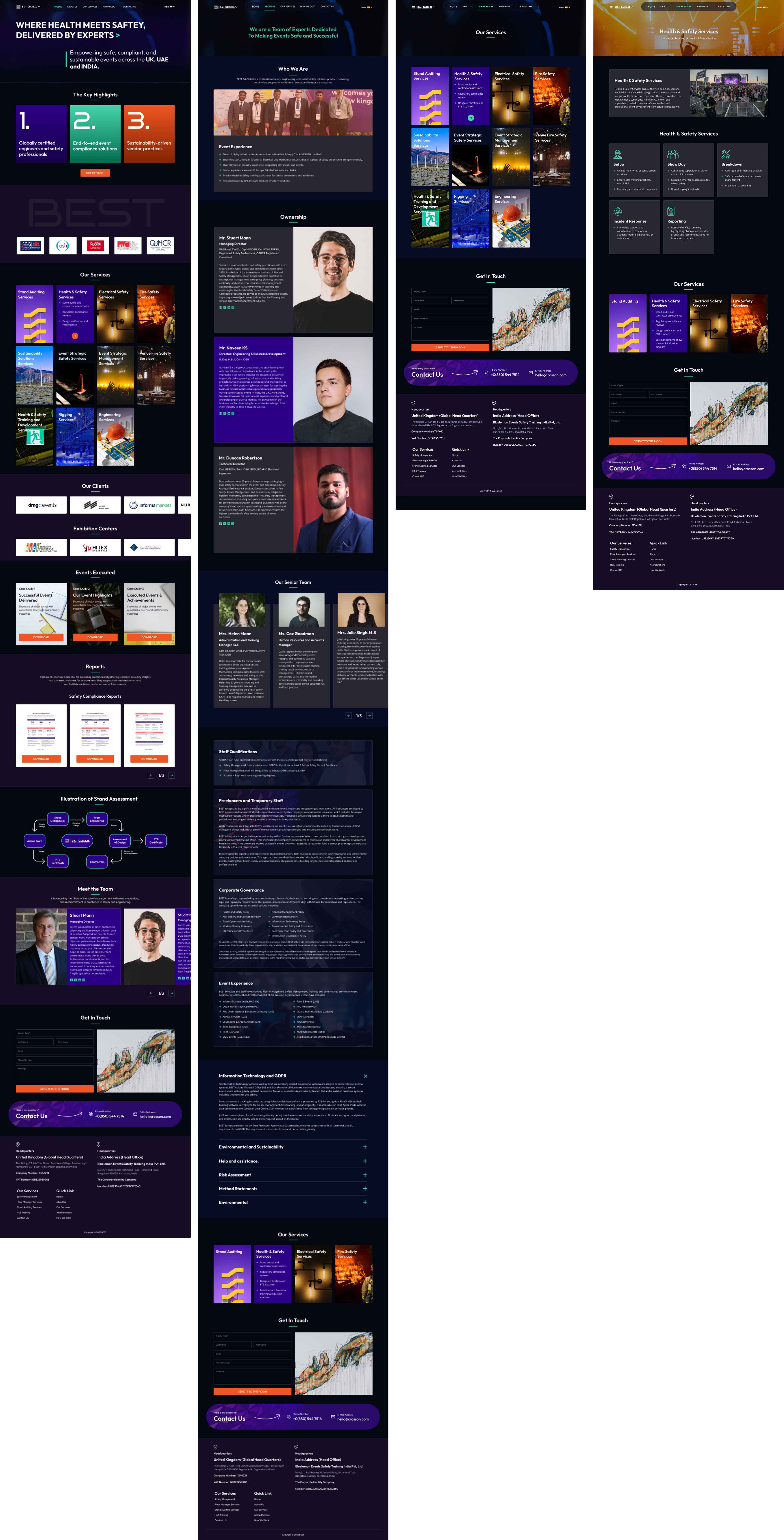
With a clearly defined strategy in place, we moved into the Design and Development phase — where structure, aesthetics, and functionality came together to bring the vision to life. The focus was on creating a professional, informative, and intuitive digital experience that reflected the organization’s commitment to safety, compliance, and excellence in event management.
Our design team adopted a clean, structured, and authoritative visual language to communicate reliability and expertise.
-
Visual Identity: The color palette and typography were chosen to evoke trust and professionalism, aligning closely with health and safety industry standards.
Information Hierarchy: We used clear sectioning, iconography, and subtle visual cues to guide users through complex safety concepts effortlessly.
Imagery and Graphics: Real-world visuals from event setups, combined with infographics and process diagrams, helped make technical topics like “Risk Assessment” and “Emergency Planning” more understandable and engaging.
Accessibility: The layout and contrast ratios were designed to ensure easy readability and accessibility for users across different devices and backgrounds.
The development phase was centered around performance, scalability, and ease of content management.
- We built the website on a robust and flexible CMS, allowing the client to easily add new services, updates, or case studies without technical dependency.
- The architecture was designed to be SEO-friendly, ensuring discoverability among target sectors such as government departments, event organizers, and private venue managers.
- Responsive design principles were applied throughout the build, guaranteeing a consistent experience across desktop, tablet, and mobile platforms.
- Emphasis was placed on fast loading times, secure data handling, and modular scalability, so the site could evolve as the client’s service portfolio grows.
Colors
Our Primary Colors—Deep Blue And Sky Blue / Cyan—With Teal As A Secondary Shade, Create A Balance Of Professionalism And Warmth. Blue Reflects Trust, Orange Adds Energy, And Teal Brings Sophistication. Together, This Palette Represents ProLoanZ’s Values Of Trust, Approachability, And Modernity Across All Visual Elements.
Flame Orange
Primary Color
Navy Blue
Secondary Color
Eucalyptus
Secondary Color
Other Supportive Color
Real World Images
Real-world images bring authenticity and depth to the visual experience, helping users connect instantly with the company’s work and environment.
UI Design
We ensured the design stayed true to ProLoanZ’s brand values while giving the website a bold, engaging, and modern look. The interface was carefully designed to be intuitive and dynamic, making it easy for users to navigate and reach their loan goals quickly.
Results and Impact
The completed website delivered measurable improvements in how the company communicates its expertise and engages with its audience. It became a central information hub for event organizers, safety officers, and government agencies seeking clarity and confidence in health and safety management.
Key Results
a.Enhanced Brand Credibility
The new website established the company as a trusted authority in event safety and compliance. Through well-
structured content, authentic visuals, and verified certifications, visitors gained an immediate sense of reliability
and professionalism.
b.Improved User Engagement
The streamlined navigation and educational content encouraged users to explore multiple service areas. Time
spent on key service pages increased significantly, indicating that visitors found the information valuable and
easy to understand.
c.Higher Inquiry Conversion
The clear call-to-action structure and simplified inquiry forms led to a notable increase in client inquiries —
particularly from government departments and large private event organizers seeking specialized safety
consultation.
d.Scalable Knowledge Platform
The website now serves as a living, expandable knowledge base, allowing the client to publish updates, new
safety regulations, and case studies with ease. This adaptability ensures the platform remains relevant and
compliant with evolving industry standards.
e.Consistent Digital Identity
Across devices and platforms, the website provides a cohesive and professional user experience, reinforcing
brand identity and aligning with the client’s core mission — promoting safety, preparedness, and excellence in
every event environment.
The project successfully transformed the company’s digital presence from a static information site into a dynamic, educational, and client-driven platform. It not only elevated the brand’s visibility but also strengthened its role as an industry thought leader — advocating for better safety practices across government and private event sectors.
your project into a success story.